
Process Mapping for IT Projects: BPMN, Swimlane or Flowchart. Which Map Does Each Decision Need?


Share the page:
Process mapping is drawing how work moves through an organization, step by step, with who does each step and what it produces, so that a decision can be made about it. IT projects make three such decisions: what the system must cover, how the future process should run, and what a machine can take over. Each has a different audience, and the audience picks the notation. A flowchart for executives who need the shape in a minute. A swimlane diagram for the workshop where hand-offs are the problem. BPMN for the steps a developer or a bot will build from. This guide covers when each fits, the eight BPMN symbols that carry most maps, as-is to to-be, and how detailed a map must be before anyone automates it.
Introduction
The process map we are handed most often is a sixty-box BPMN diagram printed across two pages taped together, drawn for a steering committee that needed a six-box flowchart. Nobody in the room can read it, the sponsor nods, and the decision the map was supposed to support gets made later, by email, without it.
The opposite failure is just as common: a tidy flowchart handed to a developer who needs to know what happens when the approver is on leave, which field the rule reads, and whether the two reviews run in parallel. The flowchart does not say, so the developer guesses.
Both maps were competently drawn. Both were drawn for the wrong audience. If you searched for process mapping because a project needs maps and nobody has said which kind, this guide is the answer to that question, decision by decision.
What is process mapping?
Process mapping is drawing how work really moves through an organization, step by step, with who performs each step, what triggers it, and what it produces, so that a specific decision can be made about that work. The map is not the process. It is a model of the process at the level of detail one decision needs, which is why the same process gets mapped three different ways on a single project without anyone being wrong.
On IT projects the decisions come in three kinds. Scope: which steps the new system has to cover and where its boundaries sit, which is a steering committee question. Design: how the future process should run, who hands what to whom and in what order, which is an operations question answered in a workshop with the people who do the work. Automation: which steps a machine can take over without human judgment, which is a developer's or an RPA engineer's question and needs rules, data, and exceptions spelled out.
A process map answers one of those. Three notations serve them. A flowchart shows the shape of the process in a handful of boxes and arrows. A swimlane diagram places each step in a horizontal band for the role or system that performs it, so hand-offs show up as lines crossing band boundaries. BPMN, Business Process Model and Notation, is a standardized notation with precise symbols for events, tasks, decisions, and parallel work, maintained by the Object Management Group and published as ISO/IEC 19510, detailed enough that software can execute a correctly drawn model.
The pattern we see is a map with no decision attached. Someone was asked to "map the process," produced thirty pages of swimlanes over six weeks, and the maps went into a shared drive where they became wallpaper, because no meeting ever needed them. Business process mapping done well is cheap and fast; done without a decision in mind it is the most expensive documentation a project produces.
Key Takeaway: Before drawing anything, write the decision the map must support in one sentence. If you cannot, you are documenting, not mapping, and the map will not be read.
When should you use BPMN instead of a swimlane diagram?
Use a swimlane diagram when the decision is about hand-offs between roles. Use BPMN when the map has to be precise enough to build or automate from. Use a plain flowchart when the audience is executives who need to understand the process in under a minute. The question is never which notation is best; it is who is reading and what they will decide.
Two clarifications save a lot of argument. Swimlanes are not a rival to BPMN; BPMN has them, as pools and lanes. The difference between "a swimlane diagram" and "a BPMN model" is rigor, not shapes. A swimlane diagram drawn in a slide tool with whatever boxes came to hand is fine for a workshop and useless to a developer, because nothing in it says whether two arrows leaving a box mean "either" or "both." BPMN forces that choice with a gateway symbol, which is the whole point of it.
And a flowchart is not a lesser map. A one-slide flow that lets a steering committee agree the process starts at the application and ends at the permit, with the inspection out of scope, has done more for the project than any amount of detail would. The visual below is the chooser we use.
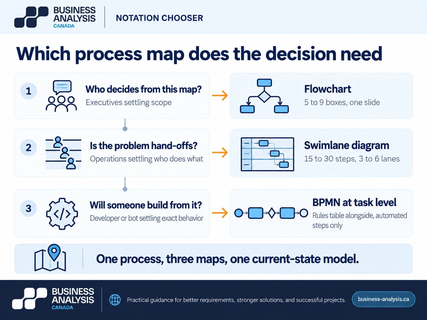
The failure that costs the most is the sixty-box BPMN at the steering committee, and its mirror image, the one-slide flowchart handed to the build team. ID Business Analysis Canada's Analysis & Design engagements produce the map at the level each decision needs: a one-page flow for the steering committee, swimlanes for the operations workshop, and BPMN only for the steps going to a developer or an RPA bot, with all three traced to the same current-state process model so that the executive view, the workshop view, and the build view cannot disagree about where the process starts, ends, or branches.
Key Takeaway: Flowchart for scope, swimlanes for design, BPMN for build and automation. One process, three maps, one underlying model.
What do the main BPMN symbols mean?
A BPMN model is built from four families of symbols: flow objects (events, activities, gateways), connecting objects (sequence flows, message flows, associations), swimlanes (pools and lanes), and artifacts (data objects and annotations). The full specification defines well over a hundred symbol variants. Eight of them carry almost every business process map, and a map that needs more is usually a map that should be two maps.
Events are circles. A thin circle is a start event, the trigger that creates a process instance: an application received, a month-end reached. A thick circle is an end event. A double circle is an intermediate event, something that happens during the process, and the icon inside says what kind: a clock for a timer, an envelope for a message. Activities are rounded rectangles. A task is a single unit of work; a sub-process is a task with a small plus sign, meaning there is a detailed map underneath. Gateways are diamonds, and they are the symbols people misuse most. An exclusive gateway, marked with an X, means exactly one of the outgoing paths is taken. A parallel gateway, marked with a plus, means all paths are taken at once and the process waits for all of them to finish at the matching closing gateway. An inclusive gateway, marked with a circle, means one or more paths, and it is the one to avoid unless you can explain it to the room.
Connectors are arrows. A solid arrow is a sequence flow: this step follows that one, inside a single pool. A dashed arrow is a message flow: information passes between pools, which means between organizations or systems that run their own processes. Pools are the large containers for separate participants, a municipality and an applicant, a company and its bank; lanes subdivide a pool by role. A data object, drawn as a page with a folded corner, shows what a step reads or writes.
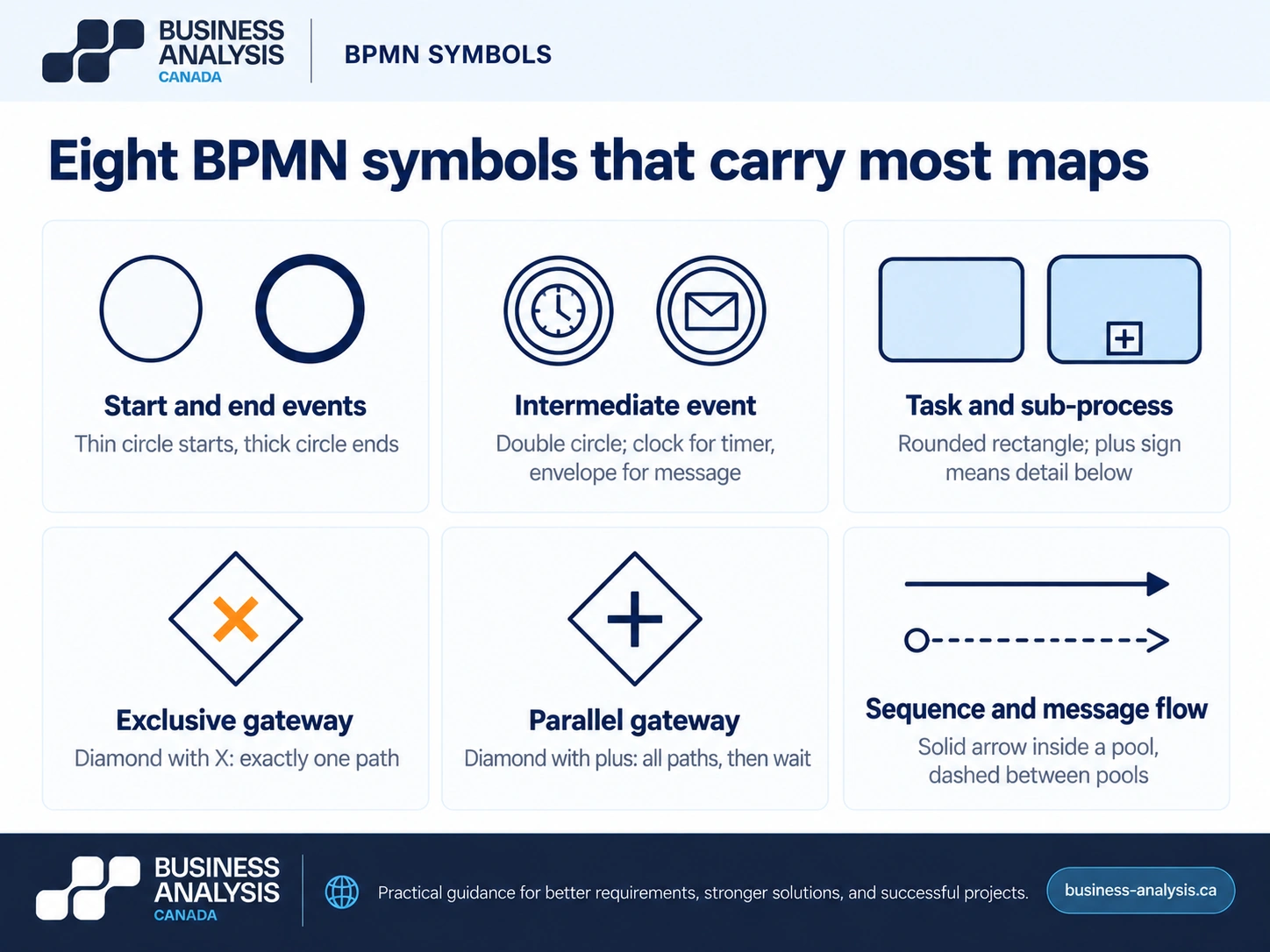
Three mistakes account for most broken BPMN. Treating the gateway as the place where the decision is made: it is not, the task before it makes the decision and the gateway only routes on the result, so the rule belongs in that task's description. Using an exclusive gateway where the work is parallel, which turns two reviews that happen at the same time into a sequence and doubles the modeled cycle time. And drawing sequence flows across pool boundaries, which the notation forbids for a reason: your clerk cannot sequence the applicant's actions, only send and receive messages.
Key Takeaway: Learn eight symbols: start, end, intermediate event, task, sub-process, exclusive gateway, parallel gateway, and the two arrows. Put rules on tasks, not on gateways.
How do you map the as-is and to-be process?
Map the current state from observation and artifacts rather than from the procedure manual, agree the problems on that map with the people who live them, and only then draw the future state, with every change tied to a named problem. The sequence matters because a to-be map drawn first is a wish list, and a to-be map drawn from an as-is nobody validated inherits every myth in the manual.
Take a process we see in a lot of Canadian municipalities: building permit intake. The as-is, mapped by sitting with the intake clerk for three real applications, ran like this. The applicant emails a PDF package. The clerk prints it, logs it in a spreadsheet, and routes paper copies to planning, fire, and engineering by internal mail. Each reviewer returns comments on paper, in sequence, because the file travels. The clerk re-keys the comments into a consolidated letter, phones the applicant with status when asked, and files the paper. Six hand-offs, three points where the same data is typed again, three reviews that run one after another because there is one file, and status available only by telephone. None of that was in the procedure manual, which described a single "review" step.
The to-be was drawn in the same workshop, after the problems were agreed and counted. A portal receives the application and creates one record. The three reviews run in parallel from that record, which on the BPMN version is a parallel gateway rather than the sequence the paper imposed. Comments go into the record, not into a letter. The applicant sees status without calling. Exceptions, an incomplete package or a conflicting review, route to a named planner. Two hand-offs, no re-keying, parallel review, self-service status. Each of those four changes points back to a counted problem on the as-is map, which is what let the steering committee approve the scope in one meeting.
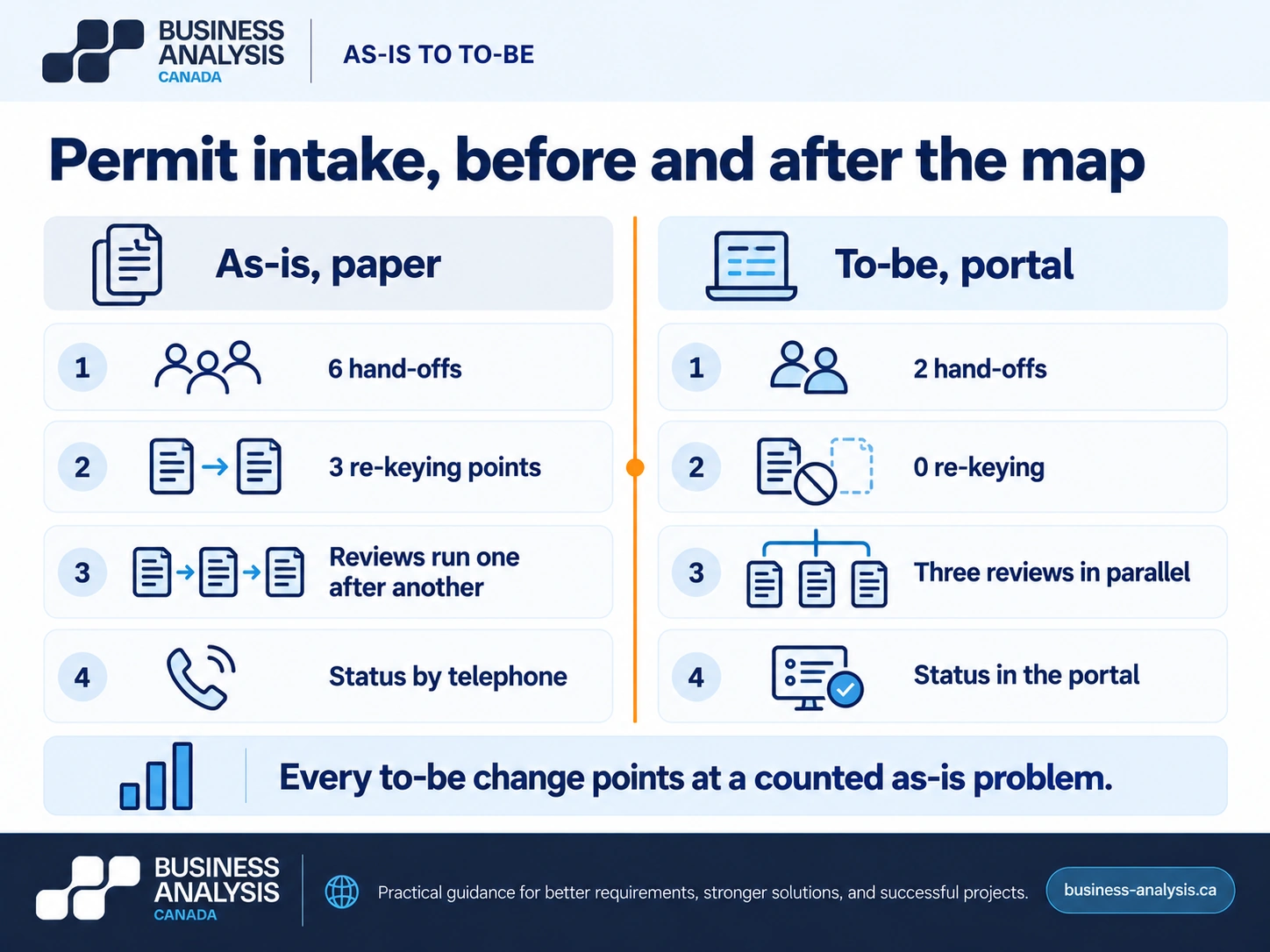
The method, in the order that works. Fix the boundaries first: the trigger that starts the process and the outcome that ends it, agreed before any box is drawn. Observe at least three real cases end to end, including one that went wrong; interviews alone produce the manual's version. Draw the as-is in swimlanes with the operators in the room, and count the hand-offs, the re-keying points, and the waits. Annotate the problems with evidence, a count or a time, not an adjective. Draw the to-be so that every changed step references a numbered problem. Then mark which to-be steps are going to a developer or a bot, because those, and only those, get taken down to BPMN task level with a rules table. The output of that last step feeds directly into requirements, which is where the discovery phase hands over to analysis.
Key Takeaway: Every box on the to-be map traces to a numbered problem on the as-is map. A to-be change with no as-is problem behind it is a feature request wearing a diagram.
How detailed should a process map be before you automate?
Detailed enough that a machine could follow it without judgment: every decision point has an explicit rule naming the data it reads, every exception has its own path with an owner at the end of it, and every step names the system it runs in and the fields it touches. Anything less, and the automation will be designed by whoever builds it, from whatever they assume.
The test is simple to state and uncomfortable to apply. For each step on the map, can the rule be written as "if this value in that system is X, do Y"? If the honest answer is "the clerk knows," the step is not ready. Most process maps fail this test at the exceptions. The happy path is nine steps; the exceptions, once someone writes them down, are twenty, and they are where RPA bots break in production. The earlier guide to what robotic process automation is draws the boundary of what a bot should touch; the map is where that boundary gets tested step by step.
Think in three levels of detail and stop at the one the decision needs. Level one is the flowchart, five to nine boxes, which settles scope. Level two is the swimlane map, fifteen to thirty steps, which settles design. Level three is BPMN at task level with a rules table alongside, and it is produced only for the steps being automated or built, never for the whole process. A whole process at level three is the sixty-box diagram from the introduction, and it costs weeks to produce and minutes to be ignored.
Two more things belong on the map before automation and are almost always missing. Volumes and timing: how many instances per day, when the peak falls, how long each step waits, because a bot that saves four minutes on a step that runs twelve times a month is not a project. And the failure paths: what happens when the source system is down, the field is empty, or the document is a scan of a scan. Those paths are requirements, and a map that lacks them is an estimate. The section on what to map first in AI workflow automation covers the volumes question in more depth.
Key Takeaway: If a step's rule cannot be written as "if X then Y" with X readable from a system, it is not ready for automation, however complete the map looks.
Frequently Asked Questions
What is process mapping in business analysis?Process mapping in business analysis is the practice of drawing how work currently moves through an organization and how it should move after a change, at the level of detail a specific decision needs. A business analyst produces the current-state map from observation and artifacts, uses it to agree problems with the people doing the work, and derives the future-state map and the requirements from it. The notation varies with the audience: flowcharts for scope decisions, swimlane diagrams for design decisions, BPMN for build and automation.
Is BPMN the same as a flowchart?No. A flowchart is an informal diagram of steps and decisions with no fixed rules about what each shape means. BPMN is a standardized notation, OMG BPMN 2.0 and ISO/IEC 19510, with defined symbols for events, tasks, gateways, and flows, precise enough that a correctly drawn model can be executed by a process engine. A flowchart answers "roughly how does this work" for an executive; BPMN answers "exactly what happens in each case" for a developer. Most projects need both, for different readers.
What is a swimlane diagram used for?A swimlane diagram is used to show who does each step of a process. Each role, team, or system gets a horizontal band, steps sit in the band of whoever performs them, and hand-offs appear as arrows crossing between bands. It is the best notation for finding duplicated work, waiting time, and hand-offs that lose information, which makes it the standard map for an operations workshop. It is less precise than BPMN about parallel work and exceptions, so it is rarely enough on its own for automated steps.
Who should create the process maps on an IT project?A business analyst draws them, and the people who do the work validate them in the room, because a map drawn from interviews alone reproduces the procedure manual rather than the process. ID Business Analysis Canada does this inside an Analysis & Design engagement: the analyst observes real cases, draws the current-state swimlanes with the operators present, counts hand-offs and re-keying as evidence, and produces the future-state map and the BPMN detail for the automated steps. The process owner approves both maps before any requirement is written against them.
Conclusion
The sixty-box diagram and the six-box flowchart were both good maps for someone. The project's job is to know who, and to draw the map that person will decide on. Scope wants a flowchart, design wants swimlanes, and build wants BPMN with the rules written on the tasks, all three hanging off one current-state model that was observed rather than transcribed.
If a project needs process maps and nobody has said which kind, ID Business Analysis Canada's Analysis & Design practice produces the three levels from one validated current-state model: the scope flow, the workshop swimlanes with hand-offs and re-keying counted, and BPMN with a rules table for the steps that will be built or automated. Book a free consultation and bring the map you have; the first thing we will do is ask which decision it was drawn for.
Sources
- Object Management Group, Business Process Model and Notation (BPMN) specification, version 2.0.
- Standards Council of Canada, ISO/IEC 19510:2013, Information technology, Object Management Group Business Process Model and Notation.
- Business Analysis Canada, First Principles: What Is Robotic Process Automation, and What Should It Touch?, business-analysis.ca blog, September 2026.
- Business Analysis Canada, Why RPA Bots Break in Production, business-analysis.ca blog.
- Business Analysis Canada, Before the Bot: AI Workflow Automation and the Analysis It Depends On, business-analysis.ca blog, September 2026.
- Business Analysis Canada, Guarding the Gate: The Value of a Project Discovery Phase in IT Strategy, business-analysis.ca blog, August 2026.