Power BI Dashboards and Reporting for an Insurance Provider
How Ivan Klepikovski led a five-person team to deliver close to 30 Power BI dashboards for a leading insurance provider, alongside an enterprise data migration.
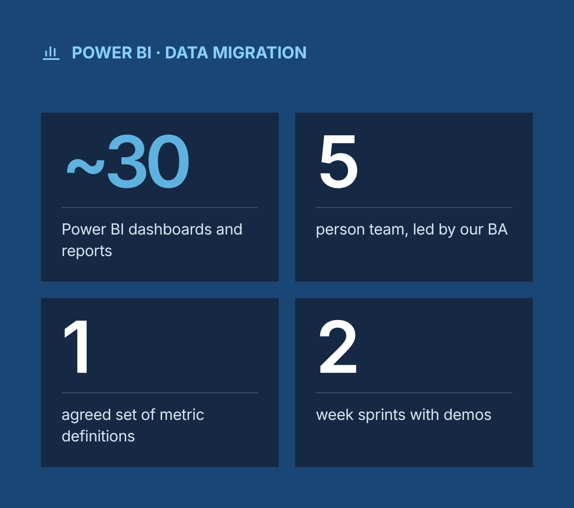
- ~30 Power BI dashboards and reporting tools delivered
- 5 person development team, led by our lead business analyst
- 1 agreed set of metric definitions across the business
- 2 week sprints, with working dashboards demoed early
Project at a glance
- Client
A leading US insurance provider with brokerage, account management, finance and operations teams across multiple offices - Solution
Close to 30 Power BI dashboards and reporting tools on a governed data model, delivered alongside an enterprise-wide data migration to NFP systems - Engagement
Business analysis, BI delivery leadership and migration support, delivered remotely from Canada - Duration
2022 to 2024 - Our role
Ivan Klepikovski led a five-person development team as lead business analyst and delivery lead. The team worked with business stakeholders, the client's data and IT teams, and the migration program team. - Scope
BI requirements, gap analysis, data modelling input, dashboard design, Agile delivery management, testing, migration reconciliation reporting and stakeholder communication
The challenge
What problem was the client trying to solve?
Leaders were making decisions from spreadsheets that took days to build and rarely agreed with each other.
- Reports built by hand
Reports were built by hand from exports out of several policy, finance and agency management systems. - Metrics that didn't match
Different teams calculated the same metrics, such as written premium, commission revenue and retention, in different ways, so numbers did not match between meetings. - Days lost to monthly reporting
Monthly reporting took analysts several days, leaving little time for analysis. - No self-service view
Managers had no self-service view of their book of business, renewals pipeline or team performance. - Data sources changing underneath
An enterprise migration to NFP systems was under way, so reporting had to keep working while the underlying data sources changed. - No proof the data had moved
Migration teams needed a reliable way to prove that data had moved completely and correctly.
Our business analysis approach
How did we approach the engagement?
We treated reporting as a product with a backlog, a shared definition of every metric, and a release process, rather than a queue of one-off report requests.
- Stakeholder discovery
We ran interviews and workshops with executives, finance, account management, producers and operations to understand the decisions each group made and the reports they relied on. - Current-state inventory and gap analysis
We catalogued existing reports, spreadsheets and data sources, then compared the current state with what stakeholders needed. The gap analysis showed duplicated reports, conflicting metric definitions, missing data and manual steps to remove. - KPI and metric definition
We built a metric dictionary with one agreed definition, formula, data source, owner and refresh frequency for each KPI. Finance and business owners signed off each definition before development. - BI requirements and backlog
We captured requirements as epics and user stories with acceptance criteria in Azure DevOps. Each story covered the business question, audience, filters, drill-down paths, security rules and expected figures for validation. - Data model design
Working with the client's data team, we defined source-to-target mappings and a star-schema model with shared dimensions for clients, policies, carriers, producers, offices and dates. Reusable certified datasets meant new dashboards did not rebuild the same logic. - Dashboard design
We produced wireframes for each dashboard and reviewed them with users before build. The design followed a consistent layout: summary KPIs at the top, trends in the middle, detail and drill-through at the bottom. - Agile delivery
We ran two-week sprints with backlog grooming, sprint planning, reviews and retrospectives. Sprint demos let stakeholders see working dashboards early and request changes before release. - Schedule and dependency management
We maintained an Integrated Master Schedule (IMS) linking BI deliverables to migration milestones, so each dashboard was repointed to new data sources in step with the migration. - Testing and release
Every dashboard was validated against agreed control totals from source systems, then went through UAT with its business owner. Releases moved through development, test and production workspaces using deployment pipelines.
Solution
What did we deliver?
Area
Business question
What was delivered
Executive overview
How is the business performing this month and year to date?
Executive dashboard with written premium, revenue, new business, retention and trends by office and line of business
Revenue and commissions
Where does our revenue come from, and is it trending as expected?
Commission revenue analysis by carrier, product, producer and client segment, with variance to budget
Renewals and retention
Which accounts are up for renewal, and which are at risk?
Renewal pipeline and retention dashboards with upcoming expirations, lost-business reasons and retention rates
Producer performance
How are producers and teams performing against targets?
Producer scorecards covering new business, book size, retention and activity, with role-based access
Carrier relationships
How concentrated is our business across carriers?
Carrier mix and performance reporting to support carrier negotiations
Client book of business
What does each client relationship look like across policies?
Client-level views combining policies, premium, renewal dates and service history
Finance reconciliation
Do receivables and commissions match between systems?
Reconciliation reports that flag differences between finance and policy data
Operations
Are service teams meeting turnaround targets?
Workload and turnaround dashboards for account management and service teams
Migration reconciliation
Has all data moved correctly to NFP systems?
Reconciliation dashboards comparing record counts, premium and revenue totals between legacy and target systems, with exception drill-down
These are representative categories from the close to 30 dashboards and reporting tools delivered.
Migration
How did we support the data migration?
BI work and the migration ran as one program, so reporting stayed reliable while systems changed underneath it.
- Mapping and transformation rules
We contributed to source-to-target data mapping and transformation rules for key entities such as clients, policies, producers and carriers. - Reconciliation checks per wave
We defined reconciliation checks for each migration wave, including record counts, financial control totals and key field comparisons. - One view of migration status
Migration reconciliation dashboards gave the program team and business owners a shared view of what had moved, what had failed and what needed correction. - Parallel runs before cutover
During parallel runs, we compared report outputs from legacy and new sources and resolved differences before cutover. - Dashboards repointed after each wave
After each wave, affected dashboards were repointed to the new sources and revalidated against control totals.
Governance
How did we govern requirements and BI quality?
Every dashboard could be traced from a business question through to tested, released content.
- Azure DevOps linked epics, user stories, acceptance criteria, test cases and releases for full traceability.
- The metric dictionary was the single source of truth. Any change to a definition went through review with the metric owner.
- Row-level security was defined as a requirement for each dashboard, so users only saw data for their office, team or book of business.
- Certified datasets and workspace standards kept development, test and production content separate and controlled.
- Progress, blockers and risks were reported to stakeholders every week, with escalation paths for decisions that affected the schedule.
Which BA techniques and tools did we use?
Techniques
- Stakeholder interviews and workshops
- Report inventory
- Gap analysis
- KPI and metric definition
- User stories with acceptance criteria
- Data mapping
- Dimensional modelling input
- Wireframing
- Agile ceremonies
- Integrated Master Schedule planning
- Risk and dependency management
- Data reconciliation
- UAT planning
Tools
- Power BI Desktop and Power BI Service
- Azure DevOps
- SQL Server
- Excel
- Microsoft Visio
- Confluence
Results
What were the results?
- ~30 Power BI dashboards and reporting tools delivered
- 5 person development team, led by our lead business analyst
- 1 agreed set of metric definitions across the business
- 2 week sprints, with working dashboards demoed early
- ~30 dashboards and reporting tools delivered between 2022 and 2024
- 1 agreed set of metric definitions used across executives, finance and operations
- Faster reporting cycles, with manual spreadsheet consolidation replaced by scheduled, refreshed dashboards.
- Self-service access for managers and producers to their own book of business, renewals and performance.
- Reporting continuity throughout the enterprise migration to NFP systems.
- Migration reconciliation that gave the program clear evidence of data completeness and accuracy before cutover.
- Operational improvements driven by visibility into renewals, retention, carrier mix and service turnaround.
“
Lessons learned
What can other BI teams learn from this project?
- Agree metric definitions before building dashboards. Most "the numbers are wrong" complaints are really definition disagreements.
- Start from the decision, not the data. A dashboard that answers a named business question gets used.
- Build shared, certified datasets early. They make each new dashboard faster and keep numbers consistent.
- When a migration is running, plan BI work against its schedule. Reports that break at cutover destroy trust in both projects.
- Reconciliation reporting is one of the most valuable things BI can give a migration program.
Do your reports still disagree with each other?
Talk to a senior business analyst about agreeing your metrics, building Power BI dashboards people trust and keeping reporting stable through a migration.
Power BI Dashboards and Reporting for an Insurance Provider
Project Description
Between 2022 and 2024, Ivan led a five-person development team focused on delivering business intelligence solutions using Power BI for a leading insurance provider. Over the course of the engagement, we implemented close to 30 dashboards and reporting tools that drove operational improvements, supported enterprise-wide data migration to NFP systems, and enabled informed decision-making through clear, actionable visual insights.
Delivered Value
- Defined and documented business intelligence requirements with stakeholders
- Created and managed user stories and acceptance criteria in Azure DevOps
- Performed gap analyses to identify improvement opportunities between current and desired states
- Oversaw the full requirements lifecycle from initial discovery to deployment
- Led Agile ceremonies including grooming sessions and sprint planning
- Managed timelines and deliverables using an Integrated Master Schedule (IMS)
- Regularly communicated progress, blockers, and risks to stakeholders
- Contributed to data migration planning and execution